brand refresh, corporate identity, colour study, style guide, business cards
Originally, Port Medical Aesthetics Clinic approached Lemonink Graphic Design to design and implement new business cards. After some initial investigations, it was found that there were very few logo files, colour formulas or style guides.
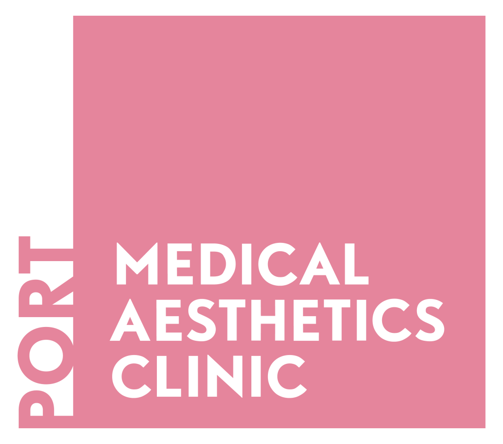
The logo works well, with its clean feel and professional look and a modern type. The use of the square creates trust, and the text being aligned to the bottom left, is grounding – perfect for a medical practice. No major changes were made to the logo, just a recreation for workability and new files produced.
I did however, design the tagline, with the same type, aligned and stacked along the bottom left; and, sometimes in its own square creating repetition and consistency.
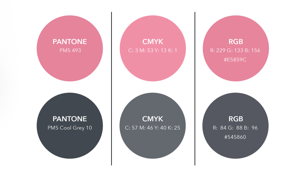
Pink and grey existed within the branding but not with colour consistency.
The pink softens the logo, catching the eye.
The dark grey highlights a beautiful neutral contrast that also softens, and is a thoughtful substitution for black.
And of course, in a medical practice the purity and freshness of white is purposeful, not just blank space.
I established the specific brand colours and their formulas along with a style guide in order to convey consistency across the brand.


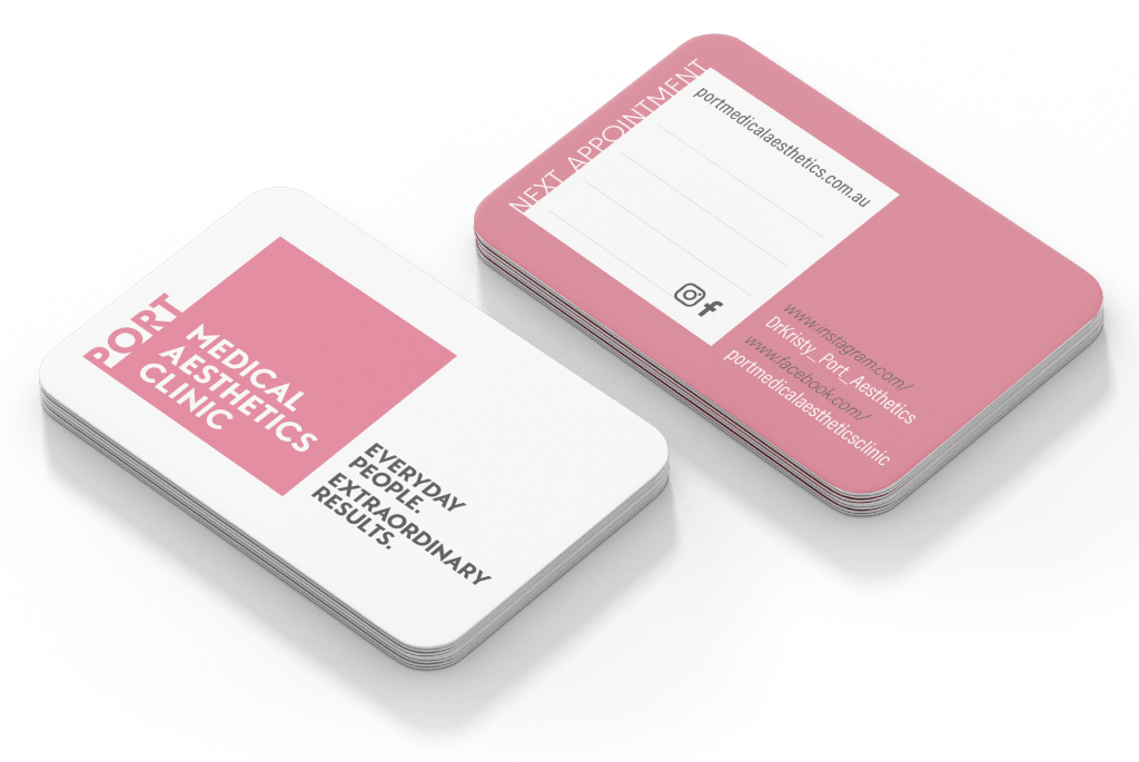
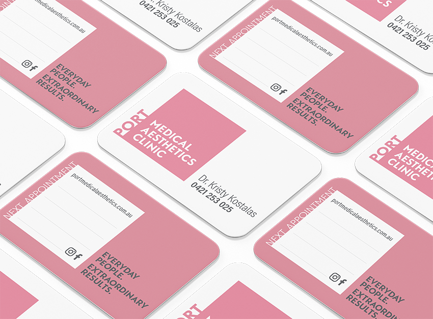
For the business cards, principles of the brand itself, as well as negative space, along with contrast, and hierarchy, have been utilised to design professional, elegant and practical business cards.
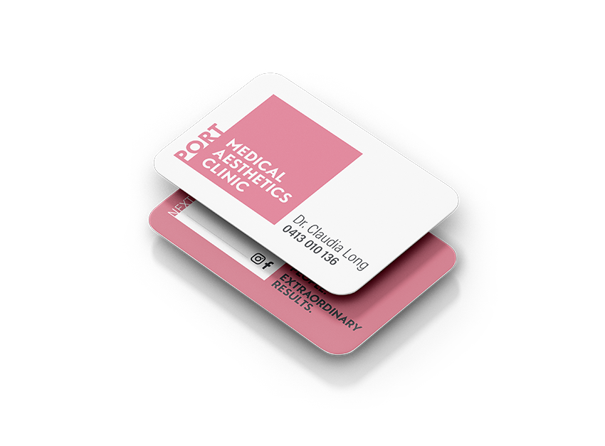
Putting into practice the integrity of the pink brand colour, I utilised pink for the logo on the front of the cards along with the entire background on the reverse side. A white square on the back replicates the logo, allowing for brand extension but also a practical place to write if needed. For contrast and readability, the grey is utilised for important information.
I recommended that round corners are used for the business cards as well as a velvet laminate on both sides. This is a thick card stock, and as it suggests, has a luxurious velvet soft feel. The round corners also speak of luxury, and contrast beautifully with the sharp corners of the logo too.
Check out Port Medical Aesthetics Clinic here
