logo, brand design,
*in development
The Dr Luxe brand is still in the development stage; however, the logo has been finalised.
With this design, there were a couple of variations which the client could choose from. While these are noticeably different, these logos all align to the creative brief.
Dr Luxe revolves around a range of quality skincare products which are fundamental and prescription grade; with a luxury look and feel – all from local experts.
The creators: Doctor & Beauty Therapist
The products: Prescription & Fundamentals
The experience: Beneficial & Luxurious
The look: Medical & Premium
Contrast was an important factor within the brief, creating both a professional and luxurious look – trusted and beautiful.
Outlined below highlights the direction chosen, flashes of inspiration, and the methodology behind the three logo designs presented to the client:

For Design #1.
Different type styles visualise the contrasts within the brand.
The ‘L’ brings together the two, by acting as an underline for the ‘official’ DR.
Both type styles share a contrast of both thin and thick line which traditionally leans towards premium.
The ‘L’ is also somewhat unique in the way it arches over the following letters, almost embracing them. The form of the ‘L’ also has future potential as a design element on its own, even as a gentle animation.
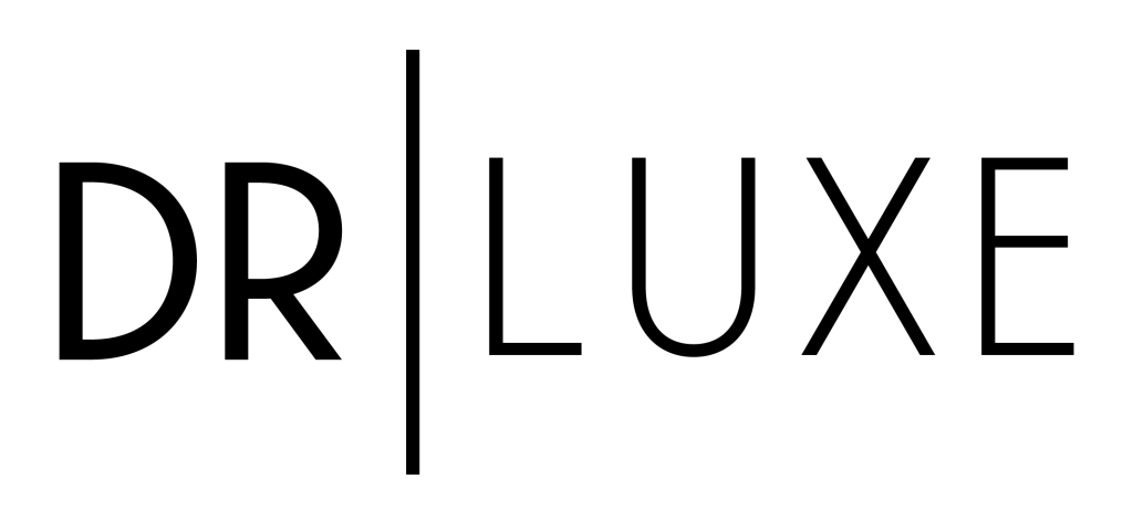
For Design #2
Different fonts within the same type family visualise the contrasts within the brand, in a clean, minimal way.
The DR is a little bolder and tighter together, representing the strong professional side, and the LUXE thinner and more open to show the premium side.
A line is used between the two instead of a period, separating the two creators rather than suggesting the same entity. This line also provides great design potential for easily representing the brand contrasts in many other media.
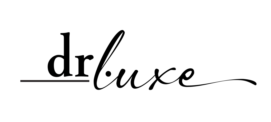
For Design #3
Different type styles visualise the contrasts within the brand, the strong serif style for ‘dr’ and a beautiful script for ‘luxe. All letters are left as lower case though, as both aspects are equally important. The ‘L’ sits between the ‘r’ and the ‘.’ allowing the two elements to be separate but intertwined and sharing the same space.
The extended underline below the ‘dr’ brings some professionalism to the ‘dr’ side and also adds to the impression that this is a signature. “Signed on the line.” As does the flourish on the end of the ‘e’.
Both the underline and the flourish have design potential in extending the brand.
