packaging, typography
While completing the “Design your Future” workshop, I was assigned a design brief to enhance, modify and improve Artisa’s logo. Artisa were impressed with my design, work-ethic, and ‘creative’ flair and our partnership continued after the workshop had finished. Artisa desired a premium quality look throughout the rest of their brand; in which I was commissioned to make this a reality.
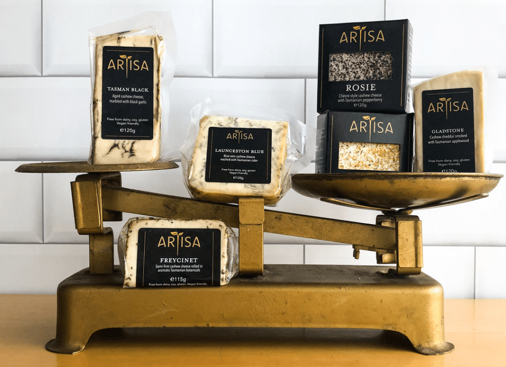
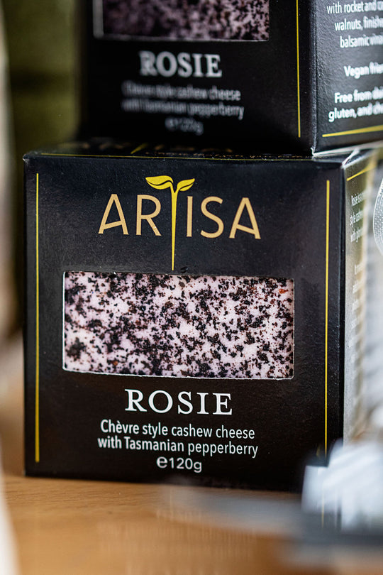
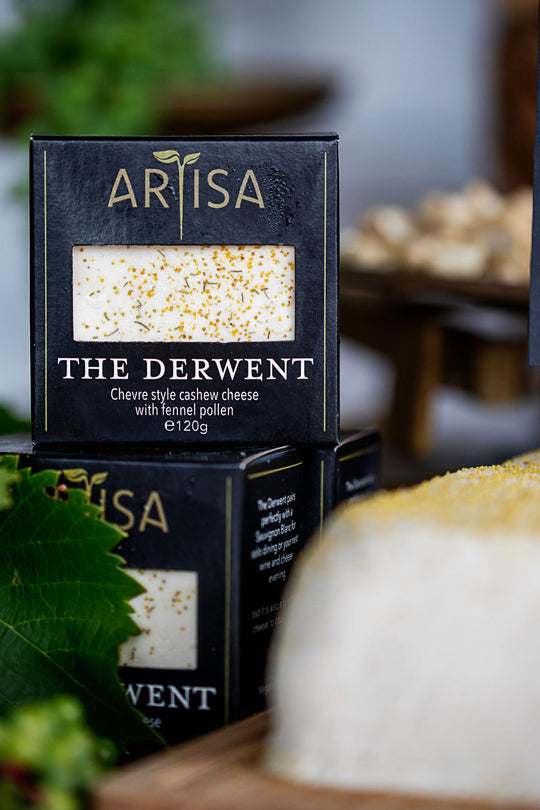
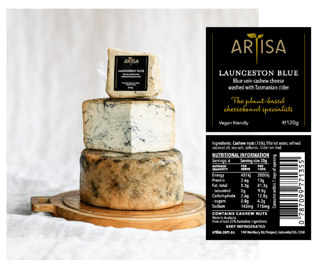
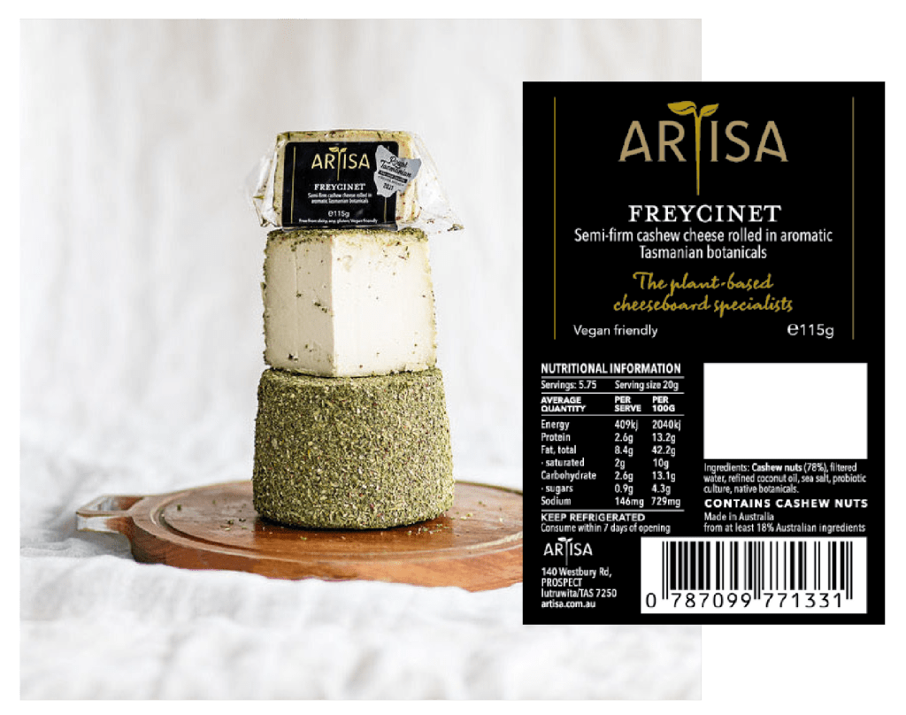
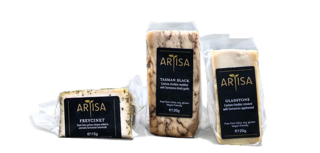
The results of this can be observed most prominently throughout their new packaging. Artisa plant-based cheese comes in a variety of shapes and sizes; as does the packaging. For some, a simple front and back label is all that is required. Others however, are a little more complex and require some finesse, from a wrap-around label to a couple which are packaged within a box.
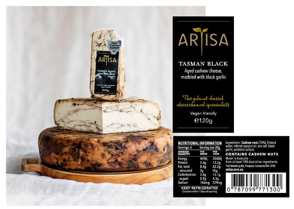
The majority of the labels are reasonably small in stature. This required a simple, minimalist approach: with white, black, and gold labels; which left the logo to tell the story. Small and minimal labels were imperative so as to make the cheese visible and ultimately the hero; with vibrant and beautiful colours to catch the eye of the consumer.
For the main face of the label, only the necessary elements were included to allow for negative space, for legibility and a premium feel.
The backs however were a different story. As with any food product, much of the information is “legally” required. The information needed to fit the label, while at the same time making the text readable to the consumer. Various fonts within the ‘Avenir Next’ and ‘Avenir Next Compressed’ families were utilised in order for the customers to be able to locate the information they require without the need to read everything on the label.
Check out Artisa here
