logo, corporate identity, branding
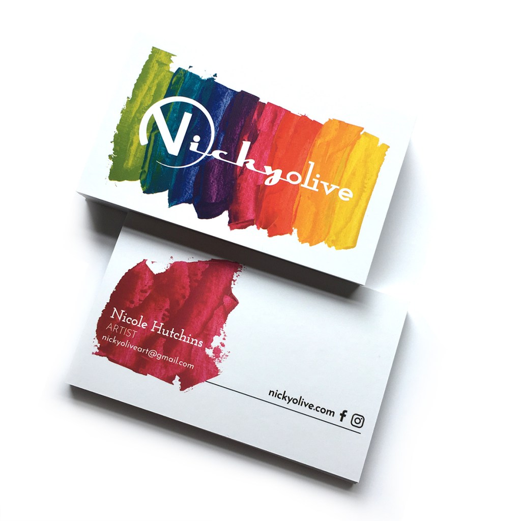
Nickyolive’s logo and identity were designed as the business was just starting out, but as the art and the business found its feet the logo was no longer suitable and a redesign was needed.
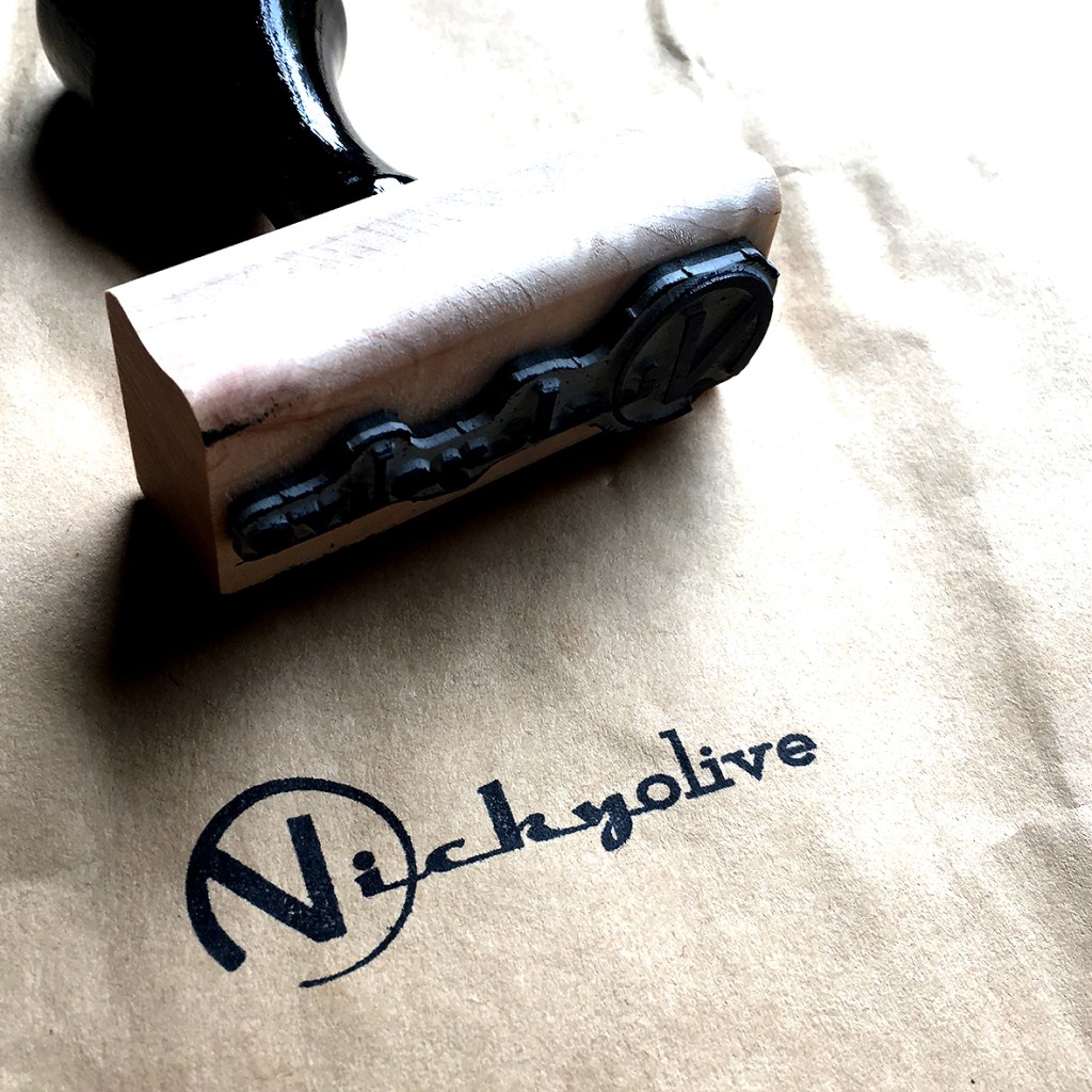
The soft green used within the logo and branding, did not represent the bright vibrant colours indicative of the paint used to create the amazing animal portraits and the wordmark had some legibility issues. Spray paint and thick textured paint is used within the portraits but on a clean white canvas, so a clean funky wordmark was designed so the interest and texture could be added, either with paint, spray paint, or stamped.
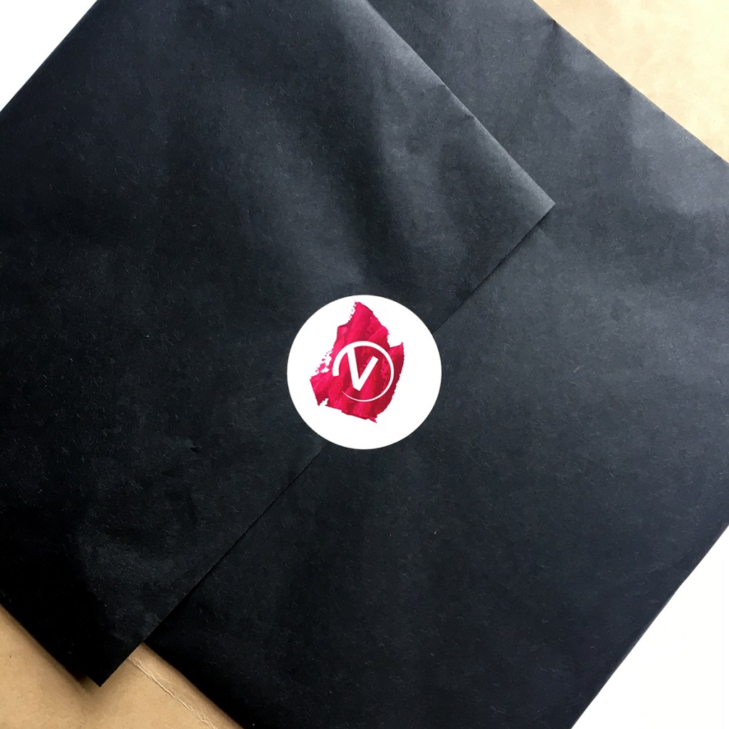
An icon was also designed(pulled from the wordmark) in order to provide some flexibility and usability.