brand refresh, logo, packaging, signage
 * with Story & Brand
Fishers of Freycinet commissioned Story & Brand in search of a brand refresh. They had amazing pickled mussels ready to sell to the charcuterie loving market but they were seeking a premium and fresh look for the shelf.
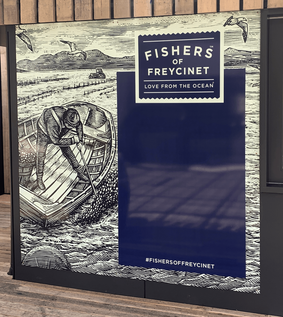
Together we investigated the ‘brand story’, with discussion revolving around the pristine waters of Freycinet Peninsula in which Fishers of Freycinet grow, nurture, and harvest mussels. The recurring theme decided on was: “love from the ocean,” this being the essence of the brand. The chosen design direction was one of energy and hard work shown in ‘wood cut’ illustrations inspired by Raymond Shepard’s illustrations in Ernest Hemmingway’s “The old man and the sea”.
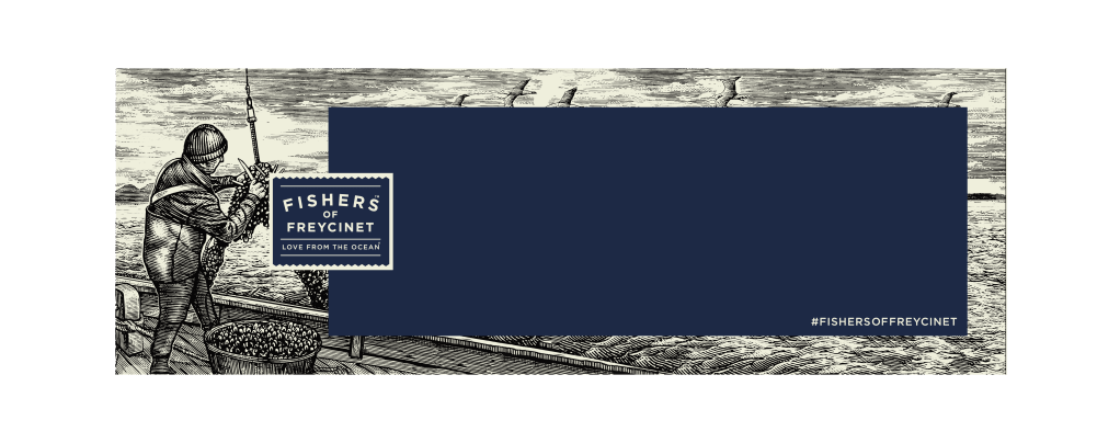
Four illustrated scenes were commissioned from an artist in the United States. These were ‘action’ oriented designs with the landscape in mind; with multiple elements allowing flexibility for use in later illustrations in several different ways.
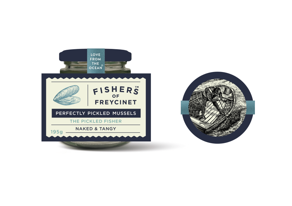
Each Fishers of Freycinet pickled mussel variety was allocated its own illustration. Space was at a premium due to the small nature of the jars, with every aspect of the jars space utilised; including the lid where the illustration resides. The nautical theme was continued within the label design, using a beautiful navy blue and cream, and a zig-zagged border to suggest both waves from the ocean and tickets for a ferry journey. A simple ‘type’ was chosen to allow the illustrations to sing, but a subtle arch within the logo is reminiscent of more traditional signage and deli-like logos of past. Colour was used to differentiate between the varieties, metallic colours were chosen and then printed onto a foil stock to enhance the metallic nature further. A high build varnish was also utilised to further enhance the premium quality of this packaging.

Fishers of Freycinet also have a bricks and mortar store where they sell their award-winning seafood fresh products and as delicious meals. Utilising the striking illustrations, menu board signage was designed for the store. Manipulation, plus enhancement was required for the illustrations to fit the necessary layouts and to convey a premium look.


check out Fishers of Freycinet here


